Saturday 12 October 2013

Week 1 Progress:..

In week one I have made quite a ot of progress, as I have so far analysed 3 magazines and have finished and sent out my survey..

Magazine Analysis: Cosmopolitan Magazine..

  Magazine Analysis: Cosmopolitan Magazine..


Masthead: The colour of the mast head is bright pink, relating to the female target audience. The masthead is also all in capital letters making it bold and eye catching to customers, even though the masthead is simple and big, it is still easily recognisable and attention grabbing mainly because of the colour making it look so bold and eye catching. The masthead is also placed behind the main images head showing that it is a well known, popular magazine as you can still tell what magazine it is and what its called even though a few of the letters are blocked out.

Target Audience: The target audience for this magazine would be females from about the age of 18-30, the magazine would have this sort of age range because it talks about sex and mentions it a lot and has articles inside about it, its also targeted at an older audience, because it talks about careers and powerful women, making it more interesting to people 18 and over as that's the age you start to get proper careers and look up to powerful women. Cosmopolitan is also targeted at women, as it is uses pink and purple colours making it more feminine and it is also all about the new look fashion which is more interesting to women and people of an older age who can afford the latest fashion, not really younger students of about 16 or younger.

Price/Date: The price of this magazine is about £3.50, its one of the more affordable fashion magazines, however is still a high end fashion magazine as it is targeted at an older target audience, applying to an audience with a higher socio-economic status, not mainly people in the D and E category as this amount of money might still seem expensive for a magazine. This magazine also includes the season on it, 'Summer' is the magazine covers main cover line and is the first bit of writing you look at one the magazine. Summer is appealing to the audience as it would relate to the time of year, encouraging the audience to buy it as it would have all the new fashion etc at that time of the year and most people want to know the latest fashion and how they have changed from the previous season making it stand out and eye catching making people want to buy it to see whats inside.

Main image: The main image on this issue of Cosmopolitan is of Alesha Dixon, a famous singer. This image is quite sexualised still as she is looking directly into the audiences eyes and is pulling a seductive pose, showing the whole of her body off, however this image is more classy and she is wearing covered up and chic, fashionable clothes, making it less sexualised to most main images. The main image is also centred right in the middle of the cover, it is the only image used on the cover, making it more eye catching and bold to the people buying it, the fact that not many cover lines are placed over the image shows off her face and pose more making it attention grabbing to the people that see it.

Cover Lines: There are a lot of cover lines used on this cover of Cosmopolitan, this makes the cover look busy, fun and interesting, making it more eye catching and attention grabbing for the audience that see it as they will be attracted at the main cover line first and then read all the smaller interesting cover lines. The cover lines also help show the kind of audience the magazine is for, because they include lines such as 'New Orgasm', 'Fantasy Sex' and 'Careers' this all helps to show that this magazine is for an older audience as the type of things is talks about in the magazine would not be suited for a younger audience. The fact that the cover lines also mention make up, nail art and fashion all show that it is a magazine mainly targeted at a female audience. The cover line underneath the main line says 'See it, want it, wear it' this is catchy and attention grabbing because of the short and snappy words before the repetition of 'It', cover lines like that are attention grabbing and make you want to read them. The number 497 is also attention grabbing at a first look of the magazine and draws attention to itself as it looks like a sticker that has been stuck on, the way its placed and the bold use of numbers make you look at that part of the magazine most and then realise that's how many fashions buys are inside the magazine which is appealing and would be worth the money to most people, encouraging them to buy the Cosmopolitan issue.

Wednesday 9 October 2013

Magazine Analysis: Elle Fashion Magazine..

Elle Fashion Magazine...


http://wac.450f.edgecastcdn.net/80450F/theboombox.com/files/2013/03/nicki-minaj-elle-magazine-cover-march-14-2013-456.jpg


Target Audience: The target audience for this magazine is mainly women aged 18-28, its aimed at older teenagers to people in their late 20's because it is a higher priced magazine making it less appealing to a younger audience like 13-16 year olds as they are normally students and would not have enough money to spend on this high end priced magazine. Elle could also be more appealing to the teenagers and early 20 year olds because of the recent upcoming and popular singers and actresses they use in their magazine for interviews, people of an older age that see Elle might not necessarily know most people they use in their magazines, making it less appealing to older people.The magazine is also aimed at women mainly, as it is a fashion magazine, advertising womens latest fashionable clothes, it also includes powerful women in the issue and iconic role models of women, hair and make up tips also making it aimed at a female target audience as opposed to men.

Masthead: The masthead 'Elle' is all in capitals, its bold and simple but however, is eye catching to the customers as it is a bright yellow coloured masthead on a dark background making it stand out more and attract attention. The masthead is also placed behind the main images head showing that it is a well known, popular magazine as you can still tell what magazine it is and what its called even though one of the letters are blocked out. As well as being on the front cover of the magazine, the 'Elle' masthead is also used under the photos of the people inside the magazine too, showing that it is constantly in the customers face, advertising 'Elle' wherever they can.

Main image: The main image inside and on the front cover of the magazine is of the famous singer, Nicki Minaj. The front cover for Elle has made Nicki Minaj look sexualised as she is posing in a sexualised way, locking directly at the camera, making full eye contact into the eyes of the customer. Its also made to look sexualised as you can see her whole body not just her face, making it more obvious and sexual looking. As well as pulling a sexualised look they have made her look more natural with less make up and made her more exposed. She is wearing an unzipped tight top which shows off her body more making it look sexualised and attention grabbing from people that see it, the unzipped top links with her interview in the magazine as it says 'Nicki Minaj unzipped' they have used the title of her interview in the magazine as the inspiration to how she looks and is dressed, they've made her look unzipped, open and revealed which is how she would feel and seem in her interview with Elle. Although it has links to the main cover line on the front cover, they have still made her look attractive and eye cathching to get attention they want from customers to buy it.

Cover lines: The cover lines on the front cover of Elle are distributed around the main image of Nicki Minaj, so that they don't detract from her as the main element on the magazine, the cover lines don't run over her image making it look more exposed and on its own, bold and eye catching in the middle. The cover lines don't have a lot of colour change on the front of the magazine, they stick to basic yellow and white colours, yellow and white are not associated with either men or women specifically so the magazine is not made to look girly in pinks or for boys in more masculine colours like blue. What the cover lines actually say relates to the target audience, as they say 'The 10 most powerful women', 'Flawless skin, sexy make up!' and 'Prettiest hair'.. the cover lines suggest that the magazine is mainly aimed at women as it mentions make up, pretty hair and powerful women, all things that would normally be of more interest to women then men.

Price: The price of Elle magazine in the UK is around £4.99. The magazine being this expensive shows that it is a high end fashion magazine that would be suited to a wealthier and slightly older target audience, it is more likely to be bought by people with a higher socio-economic status in the A, B and C categories, students wouldn't buy this magazine as it is more expensive to people with their amount of income.

Rule of thirds: This magazine does stick to the rule of thirds a lot as it has the cover lines and main cover lines either side of the main image in the middle. So if it was split in 3 vertically and horizontally then the rule would apply.

Friday 4 October 2013

Magazine Analysis: Vogue Magazine..

Magazine Analysis: Vogue magazine..


Main image: The main image on the front cover of these Vogue magazines are of Beyonce and Michelle Obama, both of their images cover the whole of the page, making them stand out to be the most eye catching part of the magazine. The way that both Beyonce and Michelle Obama are dressed on the cover representing them to be classy and sophisticated for its readers, both women are dressed appropriately, not revealing too much and are both naturally posing, they are not made to look too sexualised due to the audience of this magazine. The main image on both these magazines are of powerful, iconic women who are role models to lots of people, the fact these types of people are chosen to be on the front cover show its a strong, classy magazine. The main image and the cover as a whole is representing women as strong and powerful leaders.

Masthead: The masthead is big, bold and stands out as it is the colour white behind the coloured photos, its recognisable to anyone that sees it as the Vogue font and logo is very popular and well known. You can tell the masthead is well recognisable as both of the images on the front, cover over the Vogue lettering in the background, showing that even though the name is covered up you can still tell its a Vogue magazine. The masthead is simple, bold which relates to the more sophisticated and wealthy audience that would buy the magazine.

Audience: The type of audience for Vogue magazine, is women around the age of 18-35, the magazine is suited to older women because it is a classy magazine, full of articles as well as images and fashion clothes, its also aimed at an older audience because of the expensive brands that Vogue advertise, a student wouldn't really buy this magazine to go and buy the types of clothes it advertises, however the younger audience may buy the magazine too, as it is full of the latest fashion and celebrities that they might look up to, making it appeal to younger women too. You can tell the magazine is aimed at more of a female audience, as it has pink writing on the front, and and also has powerful, 'Power 2013' women on the front, other famous females are listed on the front, which may appeal more to a female audience as they look up to these women or idolise them and want to read about them in the magazine.

The audience for Vogue magazine would also be for people of a higher socio- economic standard, mainly people in the A,B and C's, this is because it is a classy, expensive magazine, it is expensive to buy and also advertises well known expensive brands of clothes etc, appealing to a more wealthy person, students of people that have a lower socio-economic standard in the D and E's would probably not buy Vogue as it is expensive and would not appeal to their lifestyle as much.


Cover lines: The main lines on these magazine covers, are normally the name of the celebrity on them so on these Vogue issues the main lines are 'Beyonce' and 'Michelle Obama' the main lines are the names of the celebrity on the cover or included in the magazine because this is the first thing the customer would read on the magazine as it is bold and big in their face and with it being the celebrities name, if the customer saw their name and liked that person they would be more inclined to buy the magazine.

The Vogue front covers are quite simplistic and elegant, they don't use a lot of colour, just plain black and white and they also use an easy to read, basic font. The cover lines also are in capitals to appeal more to make the customer stop and read what it says. The cover lines have bigger subheadings, with the small cover line underneath, which people would read last, the cover lines that Vogue use try to make you find something in the magazine you like to make you buy it e.g the Beyonce cover of Vogue has her name in big writing, and the other coverlines are of other female celebrities to attract the customer to notice a celebrity they like and buy the magazine as they are in it. The cover lines also use the words 'Elegant', 'Inspiring', 'Chic' and 'Strong', because the cover lines are using words like these, it attracts the write kind of audience, making women of an older age who see the elegant and chic clothes to suit them and not the latest trends teenagers are wearing, the cover lines represent the type of audience for the magazine.

Price: The price of Vogue magazine in the UK is around £6.99. The magazine being this expensive shows that it is a high end fashion magazine that would be suited to a wealthier and older target audience, it is more likely to be bought by people with a higher socio-economic status in the A, B and C categories, students wouldn't buy this magazine as it is more expensive to people with their amount of income.

Sunday 29 September 2013

Textual Analysis, Miranda..

Textual Analysis: 


Visual Codes: The way the main character 'Miranda' is dressed is casual and not very appropriate for the social occassion surroundings shes in, in these scenes from the programme. The people around Miranda are dressed well, they look posh and classy and fit in with all the other people in the scene, looking as if they belong in the social gathering. This visual code, implies to the audience that Miranda does not fit in with these people or in the certain classy, posh atmosphere, leaving the audience to feel awkward for her, finding it funny and ammusing to watch.

Audio Codes: The laughing inbetween jokes that the Miranda tv audience makes is a cleverly used audio code, because it makes her jokes seem funnier then they are and also makes the audience watching see how funny she is, encouraging them to laugh when the people on screen and the screen audience do. Also, the high pitched, upper class stereotypical laugh, is an audio code used to show how different these two types of peoples laughs and accents are showing how awkward and out of place Miranda is, making it comical.

 Technical Codes: The use of different camera angles in these two scenes from Mirada are good technical codes. Miranda firstly uses the camera to directly speak into, this makes her connect with the audience as if they are the only ones that can see her taling making them feel more empathy for her in the situations, Miranda also uses this direct camera angle to creat effect on the audience so they feel more involved, e.g by asking rhetorical questions as if they really are there talking to her. 

Another techincal code that these two scenes used, was the background camera scan, this makes you realise that all the people in the background are classy, posh and fitting in with the crowd, making it easier for the audience to outline how outcast Miranda is to all the guests surrounding her. The background pan from the camera also makes us feel empathy for Miranda as it shows she is the odd one out and shows how awkward she is feeling, making the audience empathise towards her.

The lighing used in this programme is quite bright and freindly, hardly ever dull or dark. With the use of high key lighting, the programme looks more freindly, fun and relaxed making it go well with the comedy aspect of the show, keeping it light and bright on the characters reflecting off of their jokes and actions making it more funny.

Textual analysis..

Textual analysis..


Visual codes: The way the characters are dressed, e.g in their pajamas it creates a more relaxed and calm atmoshphere like you don't expect anything bad to happen to them as there just in bed and in a natural environment, so when the lights flicker and the door goes it build more suspicion for the audience watching.

Another visual code, would be the characters facial expressions. The mans facial expressions and body language are good to build tension for the audience, as he looks confused and not ready for anything thats about to happen leaving the audience in more suspense with no clues in his expressions as to what is about to happen. The woman's facial expressions connect to the scene well, as her body language and facial expressions show just how scared she is and that it wasn't expected, leading the audience to not know what to think will happen next.

Audio codes:  The non- diegetic music in the background adds a lot of effect to this scene in the movie. Its non- diegetic as you cant see where its coming from and the characters aren't making the noise. The non diegetic sound is clever as it adds a lot of effect and thrill to whats about to happen, making tension as to whats about to happen and when the music starts the audience know something bad is going to happen soon. The diegetic sound throughout this scene shows the creepy, weird things that are happening, like the buzzing of the lights and the knocking at the door, the baby crying also creates effect as if something bad is happening and it has woken the baby up. Diegetic and non- diegetic sound have both been used in this scene from insidious and they create a scary, suspension and effect for the audience.

Technical codes: There is a lot of low key lighting at the start of this scene in Insidious, this makes it more scary as it is dark and night time, making the audience expect something bad to happen. The low key lighting makes the characters less seen at certain points so that the audiences attention is on the scary characters that pop up behind the curtains. The high key lighting, shown in the baby's room, makes it look safe and peaceful, however this gets contradicted when the high pitched slow, scary music starts and the scary character is shown. The lights also flicker when the face appears behind the curtain, creating a more scary atmosphere.

Another technical code from this scene, is the camera angle and shots. The camera angle of this scene from Insidious, shows the camera pointed at all the characters, as if someone is filming them or sneaking up on them creating more tension for the audience.

Sunday 22 September 2013

Audience task: X Factor..

X factor Audience Task      


The popular TV show 'The X factor' is intended to a family audience, this programme is suitable for all ages and for a family audience at the weekends. All ages can enjoy this programme as it is funny in places for the younger audience, and then has the emotional auditions shown for the older audience to connect with. The X Factor is also mediated with the cleverly edited auditions to make you like certain contestants more than others, e.g the people that are not very good singers are sometimes the ones that get more of a fan base then even the best singers on the show. For example this man in the clip from the show this year, he is not the best singer but got the best reaction and TV showing on the TV programme, helping him to get a better fan base then even the best singers shown on the same night as him. Other examples of this from previous years would be Jedward and Rylan Clarke.

The X Factor is cleverly constructed, as it is edited to show only the best and worst acts. The worst people are shown on this programme to make the audience find the show interesting, entertaining and fun, they use the worst auditions to create attention to the programme and keep the viewers watching. The best auditions are also shown to put the contestants in the spotlight and to let the audience connect with their favorite acts. Little kids to over 60's can watch this programme and like it, so this programme has a wide target audience.

Audience task: Antiques Roadshow..

Antiques Roadshow Audience Task..


This programme 'Antiques Roadshow' is appealing to an older target audience, probably those over 60 years old. This programme is intended to appeal to an older target audience, because the types of antiques and history involved in this programme is appealing to an older audience as its a gentle, slow programme that's easy to understand and older people are more likely to be these type of collectors and therefore are more inclined to watch the TV show.

This programme is mediated and constructed into little clips of the most interesting antiques and the ones that are disappointing. Its constructed to show the best and worst clips of the people that go on the show, to keep the programme interesting and short in parts to show a few people on each episode. The programme is very formal and is very factual and full of history and information, keeping it appealing to those older viewers of the audience.


Friday 20 September 2013

Audience task: The Only Way Is Essex..

Audience task: The Only Way Is Essex 


The intended audience for the programme The Only Way Is Essex (Towie), is mainly teenagers and adults in there early 20's. This age range of audience is due to the language they use, older viewers might not find this as appealing to watch and also, the types of things these people do, the holidays, the arguments, teenagers are more likely to find amusing and relate to them.The use of gratifications this programme meets is entertainment, this programme is for entertainment purposes, its a reality TV programme which gives you an incite into these peoples lives, and due to it not being a very serious show, the audience find it entertaining and like certain characters in it.

The programme is constructed by editing the best bits of what they have filmed, the programme is cleverly constructed and is only full of the interesting parts of the people lives, such as the arguments, parties and holidays that they go on. These edited clips are mediated also, because they make you like certain people in the programme more than others, the arguments are shown in a way and edited that you see one side, mediated to make you like one person more and think of the other as a bad guy.

Sunday 15 September 2013

Race Representation..

Race Representation.. 

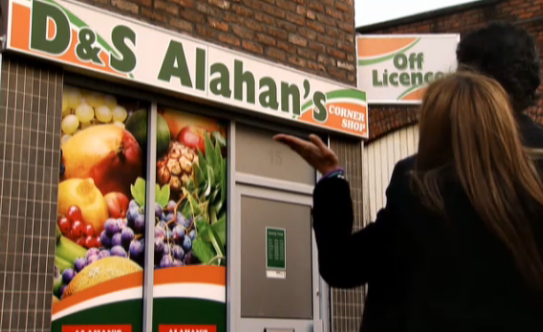
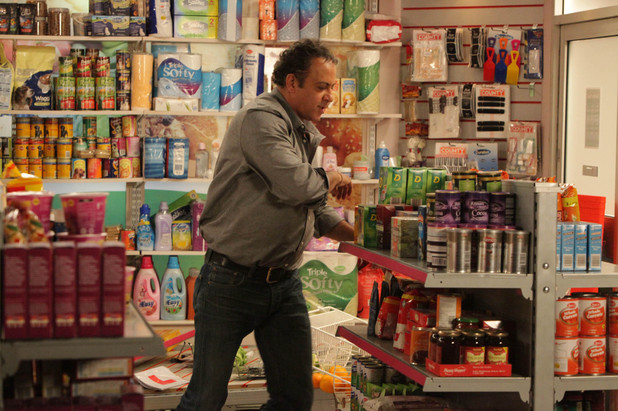
For race representation, I chose to use the character 'Dev Alahan' from the soap opera Coronation  Street. The character Dev is given a positive race representation in this programme, because all though it is stereotypical by giving him the job of working in a corner shop, it is a positive representation as it shows Dev as being a business entrepreneur and not only owning a corner shop, but also a kebab shop and multiple other shops before the recession. Dev is quite a wealthy character in the TV programme and is a member of an exclusive gold club and has an expensive car, he is also a nice, friendly, family man and his race is respected in the programme and all though a stereo typical Indian character, he has a positive race representation in the media.

Sexuality Representation..

Sexuality Representation..


 I chose the character 'Kurt' from the TV show Glee as my representation of sexuality. I chose to use Kurt as my example of sexuality representation in the media, because in Glee the character of Kurt is gay and I think that the programme represents Kurt in a positive way because of his sexuality, all though the character is singled out in parts by people because of his sexuality, the TV show, shows that Kurt being gay and having a different sexuality to others inst a bad thing and change that around to make him a better character and gain new friends, I  think this is a good representation of sexuality in the media, because it is a positive representation and connects to other people in this characters situation.


The only negative part about the sexuality representation, is that the programme Glee has made the character Kurt a very stereotypical gay person, being part of the school singing club, they have made him act like a diva, sing quite girly songs, dress up as women, wear make up and really focused on fashion. These are all the kind of stereotypical views people have on gay people and the kind of things they like, which is negative as it is very stereotypical and not necessarily a true reflection of all gay people.

Saturday 14 September 2013

Age Representation..

Age Representation 


 This clip from the popular Pixar film 'Up', is a good example of age representation in a film. This clip is a negative representation of the elderly age group, it shows this elderly man being a stereotypical grumpy old man that finds kids annoying and in the way trying his hardest to get rid of the boy. This is a negative representation of the elderly age group as its showing older people to be grumpy, slow and irritable when actually not all old people are like that, some could actually be the opposite to this character (Carl) in Up.

The portrayal of the character Carl in the film has to be exaggerated as the film has more of a young audience, and the character needs to be stereotypical and grumpy so the children watching find him funny and easier to understand.

Gender Representation..

Gender Representation..


The TV show Geordie shore, is a negative representation of females and males. It represents them as being childish adults, showing them in a bad light and highlighting their rude, chaotic behavior. The programme shows them going around Newcastle partying, getting thrown out of clubs and behaving in an inappropriate behavior for TV viewing. It represents males and females in a bad light, leading the rest of males and females in society to be stereotyped by the public as these types of characters from Geordie Shore.


Friday 13 September 2013

Class Representation..

 Class Representation


This is a positive representation of the 'Duchess of Cambridge' the Daily Mail says she "glitters in pale gold sequins" showing that she looks good after just giving birth to her first child Prince George and that everyone was happy to see here appearance on the red carpet.

Also this piece portrays Kate in a positive way in the fact she is at a charity event. The article points out that she is a new mother but still has time to raise awareness for a charity, putting a positive spin on the event. 

The vales of this media are to show the Duchess in a good light since having been away from the media for a while after spending time with her new baby.